On autumn coming, all new trends come back and you can discover them next year.
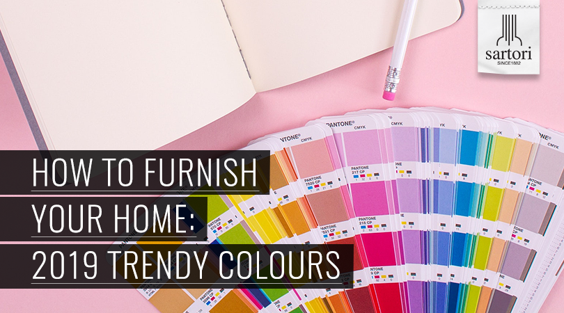
Thanks to Pantone, world leader in colour industry, the latest trends about the most popular shades for 2019 make their way.For all sectors (fashion, graphics, interior design) the colours which will be more fashionable in the next few months have been announced.
First of all, you must leave the last few years’ pastel and light shades to welcome richer and more saturated ones.
But let us look at the 8 palettes that Pantone Color Institute suggests for 2019 interior design:
- Cravings, from its dull red to bordeaux which will be a must in wintertime while deeper and brighter red will be fashionable in springtime. A palette with warm tones devoted to food with perfect shades for fabrics and quilted to be put in kitchens and sitting rooms. Even an interesting touch of red to the walls!
- Meanderings aims at cosmopolitan culture where journeys and different ethnic groups merge to make a unique global vision. A chromatic mix made up of blue and sky blue, green, ochre, orange-red and rose. The perfect mood to have great time playing with odd and bright matchings among different printings and materials.
- Classic is the simplest palette of all. As its name suggests, it reminds of classicism with evergreen colours having relaxed tones. Industrial style is fantastic with its finishes of matter such as wood and bricks to be matched with rust brown, black, grey, camel and white.
- Syncopated turns yellow! More precisely, the shade proposed for 2019 is spiced yellow which reminds of curcuma and curry. It is perfect to give a touch of strength to your rooms; the matching with cold colours like grey, blue and sky blue is perfect.
- Paradoxical is the palette of eclectic style. Interior design with strong contrasts for those who love attempting bright colours which are in contrast. So, bright red, purple, yellow and blue, also mixed with taste, are welcome. These chromatic matchings suggest the idea of interior design which is really uncommon!
- Musings turns out to be the palette which matches with eco-friendly interior design most. Aiming at nature, it encourages to use deep green of autumn leaves growing lighter towards spring gradually.
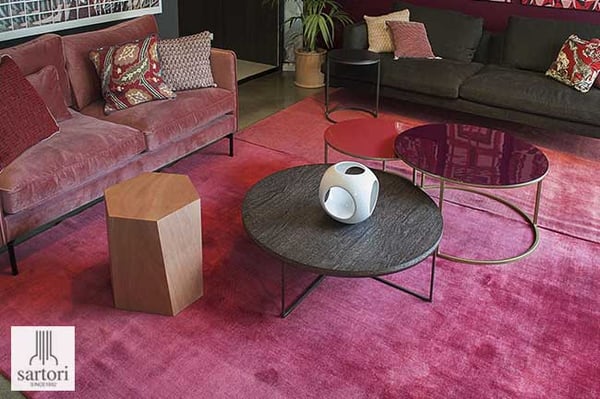
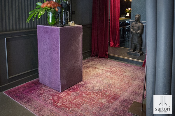
- You will use Cherish when you want to put a very chic detail in your modern rooms or to enhance their spaces. Purple, magenta and rose can give a clean trait to simple and rigorous spaces by attempting such bright accessories to attract attention at once. But you must not misuse it, remember that the key word is always “equilibrium”.
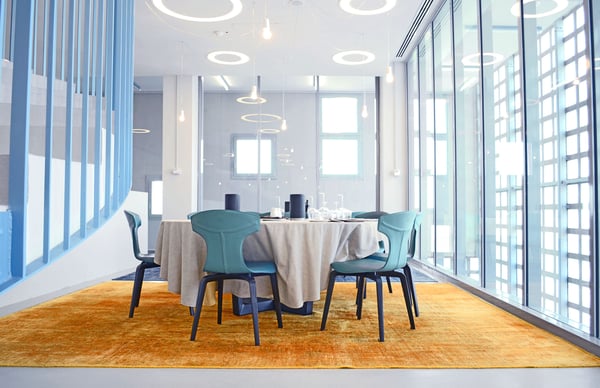
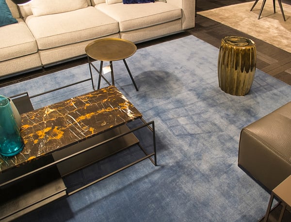
- Finally, Proximity. Characterized by a wide scale of blue and sky blue, it connects with hi-tech. From midnight blue to sky blue, you can move freely with accessories which go well with metallic finishes, grey shades but also natural wood. Creating a contrast between nature and technology.
Enjoy yourself creating your style by following 2019 colour trends!
If you want to know the way of choosing the best rugs for your interior design, download our free guide!